- Capabilities
- Getting started
- Architecture center
- Platform updates
Visualize objects with charts
Quiver supports various cards for visualizing object data. These cards take an object set as input, and return a chart or visualization. In some cases, charts can be used as a filter to drill down to selected objects. In other cases, the aggregated data from the chart (also referred to as a categorical chart) can be used as input to subsequent charts.
The most common charts for simple object set visualization include:
- Bar chart
- Line chart
- Pie chart
- Categorical scatter plot
- Numerical scatter plot
- Pivot table
- Heat grid
- Waterfall plot
Add and configure a chart
Object set charts can be found in the next actions menu under the Visualize section when hovering over an object set card. Each chart will have slightly different configuration options depending on its type. In general, you can use the editor panel on charts to do the following:
- Configure data in the Data tab.
- Change the input object set(s).
- Define aggregations: Group by properties, x-axis/y-axis properties, aggregation metrics, and so on.
- Supported aggregation metrics: Min, max, sum, average, count, unique count, percentile, standard deviation, and variance.
- Percentile, standard deviation, and variance metrics are not supported for object types backed by Object Storage V1 (Phonograph).
- Define segments (optional).
- Define the sorting order.
- Configure the display in the Display tab.
- Change the orientation of the chart, for example, changing the orientation of bars in a bar chart.
- Override the color and label of segments and metrics.
- Configure axes titles, formats and positions.
- Choose to display labels or not.
- Configure the legend: Showing the legend or not, and its position.
In the example below, we create a bar chart showing the average roof height grouped by Building Type. We then segment this by the Year Constructed. Lastly, we format the chart, changing the orientation to Vertical and the segmentation display to Grouped.
Accuracy limitations
The following object set chart aggregations have small accuracy limitations:
| Aggregation | Accuracy Limitation |
|---|---|
| Unique count | You have the option of computing approximate or exact results. Exact results are not supported for object types backed by Object Storage V1 (Phonograph) and may degrade performance for result counts exceeding 10,000. |
| Percentile | The result of this metric is always approximate. Either the relative or absolute error is satisfied; by default, the maximum relative error is 0.1%, and the absolute error is 0.001%. |
| Standard deviation | The result of this metric is always approximate due to floating point arithmetic error accumulation. Cases where a very high mean is coupled with a very low standard deviation could produce inaccurate results. |
| Variance | The result of this metric is always approximate due to floating point arithmetic error accumulation. Cases where a very high mean is coupled with a very low standard deviation could produce inaccurate results. |
Note that these limits do not apply to charts built on transform tables or materializations.
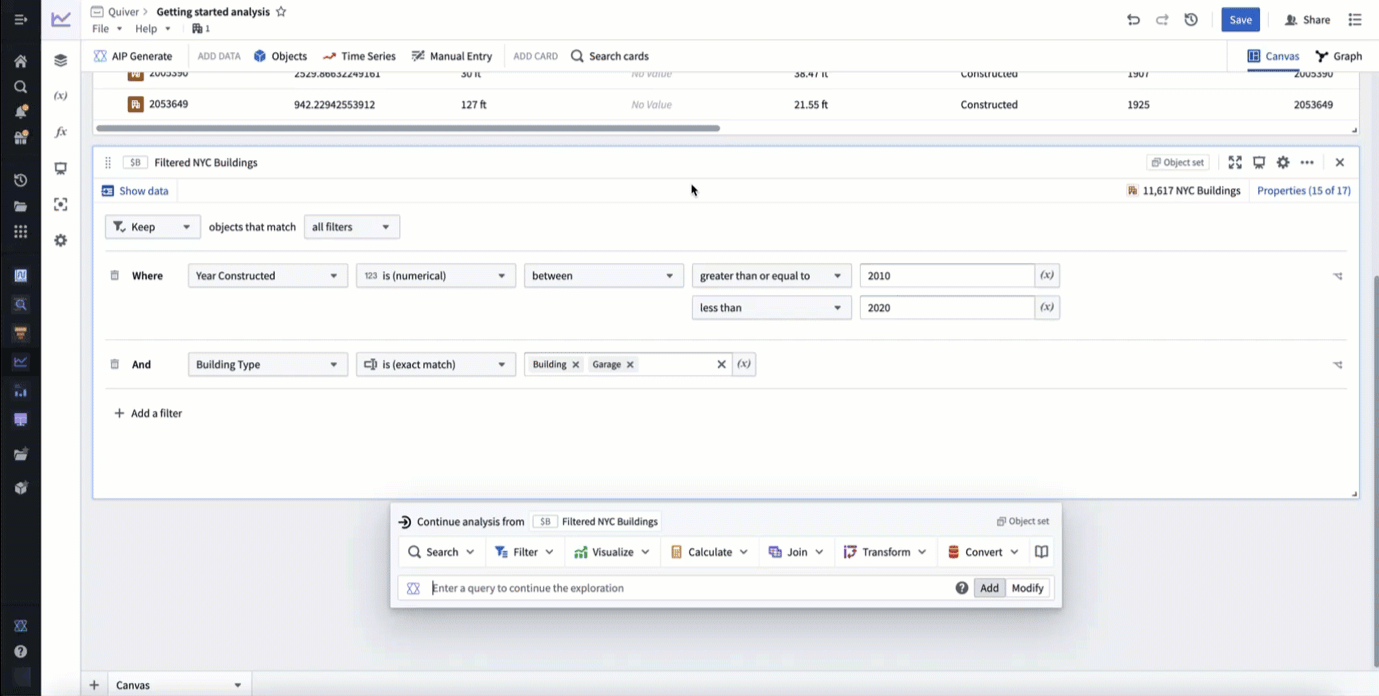
Filter with chart selections
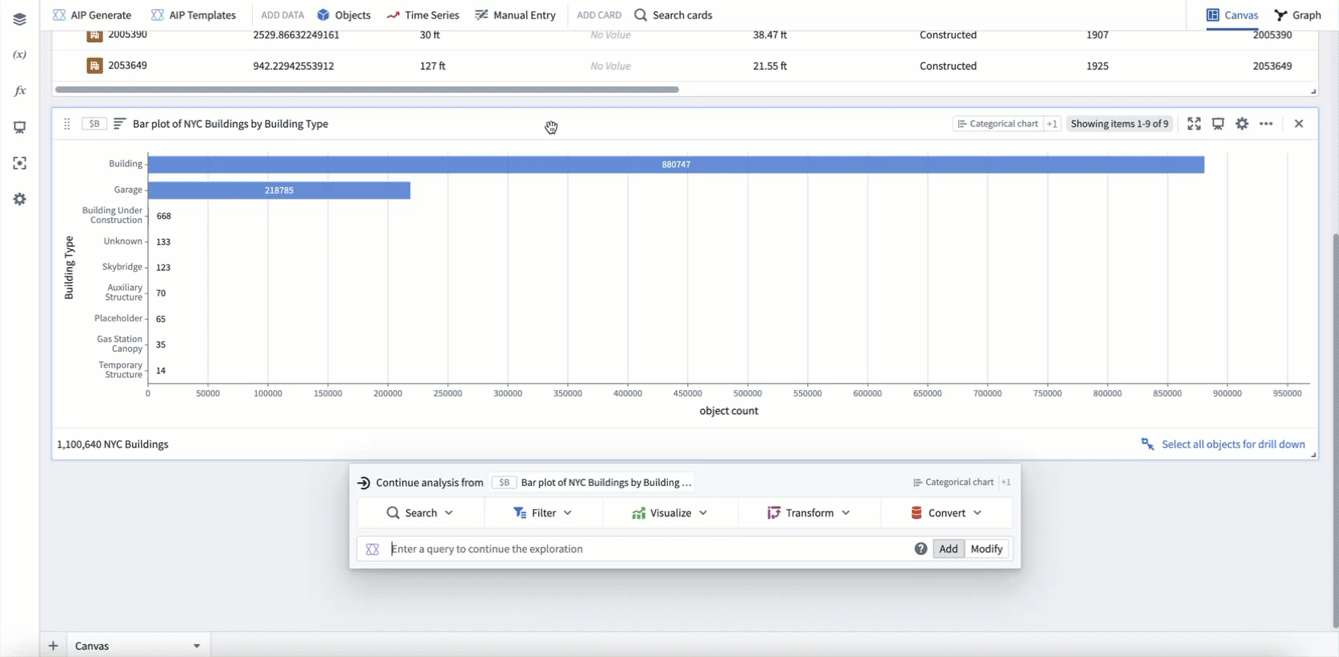
Most charts in Quiver that take object sets as input are interactive, and the underlying data behind each chart can be explored quickly and intuitively through drill-downs. The most straightforward way to perform a drill-down in Quiver is by selecting data on a chart or visualization and selecting the Drill down option in the card footer. This will create a Selection Object Set, a new object set defined by the selection of the plot. To select multiple categories in a chart, either click and drag to select a range, or hold Cmd (macOS) or Ctrl (Windows) when selecting a category.
In the example below, we select the garage category and then select Drill down to create a Selection Object Set. We can see that the object set has 218,785 objects, matching the size of the bar. We then go back to the chart and use multi select to select the building category. Our filter updates to include all building objects where the type is building OR garage. Finally, we click and drag to select a range of categories that are too small to select individually.
Cross filtering
In some cases, you may want to combine multiple chart selections such that they not only filter the downstream object set, but also filter the other subscribed charts. This offers a more horizontal and interactive experience for users, especially consumers of dashboards.
These workflows can be configured with the cross filter card.
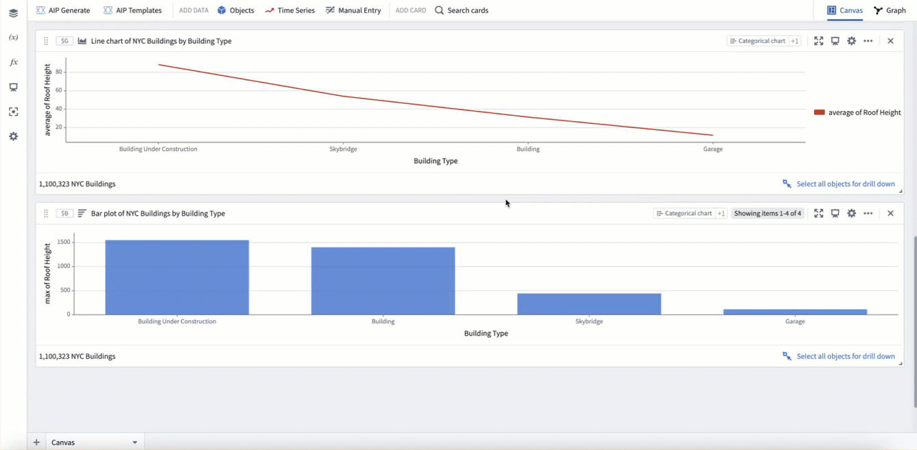
Combine charts with the overlay chart
For certain chart visualizations, you may want to overlay two charts on top of each other. For example, to show both a bar and scatter plot on the same chart, or to show data from different object types on the same chart. This can be accomplished with the overlay chart. You can add an overlay chart from the next actions menu of a categorical chart card by selecting Visualize > Overlay chart. The overlay chart will inherit any display options used by the input charts.
In the example below, we use an overlay chart to combine a bar chart plotting max roof height with a line chart plotting average roof height.
Use chart formulas
Native Quiver formulas can be a useful tool for charting more complicated aggregations. This can be accessed from the Metric configuration in the Data tab of many categorical charts. Select Switch to formula metric to begin writing a formula. This allows you to specify several aggregations to compute, and then combine them with a formula. The formula will be applied for each data segment in the series.
In the example below, we create a bar chart by building type. We then use a formula metric to compute a "range" aggregation, by subtracting the min roof height ($M1) from the max roof height ($M0), per category.
You can also use formulas in categorical charts with the categorical formula plot. This card supports using a formula to combine data from numeric values, unsegmented categorical charts (2D), and segmented categorical charts (3D). In the formula, other cards can be reference with global identifier notation (For example, $A).
Use the following reference when combining data in the formula:
- Numerics are applied to all segments of data
- Unsegmented data (2D) is combined with other unsegmented data only if the group-by values are the same.
- Unsegmented data (2D) is combined with all segments of segmented data (3D) where the group-by values are the same.
- Segmented data (3D) is combined with other segmented data only if both the group-by and segment-by values are the same.
In the example below, we first create a count aggregation of all buildings ($S). Then we create a bar chart of count grouped by building type ($T). Lastly, we use a categorical formula plot to divide the bar chart counts by the total count ($T / $S). This results in a bar chart showing count per category as a percentage of the total (as opposed to absolute count).
Use advanced aggregations in categorical charts
In some cases, you may have a categorical chart visualization that requires a more complex aggregation that is not supported by the above charting methods. In these cases, Quiver offers several options for advanced aggregations such as:
- Charting across properties on linked object types.
- Deriving a new pre-aggregation property, then aggregating on it.
- Performing aggregations that are not natively supported.
Code function categorical plot
The code function categorical plot supports using code functions to create a categorical plot. Configuring a code function categorical plot requires writing a function that returns either a TwoDimensionalAggregation or ThreeDimensionalAggregation. The function should be the same as the one needed for a function-backed workshop chart layer.
Transform tables
The transform table is a powerful tool in Quiver for deriving new properties and joining to linked objects. Any columns present in your transform table can be visualized with the categorical plot from transform table card.
Materializations
Materializations are another method of scalable data transformation in Quiver. In particular, the expression card can be useful for deriving new pre-aggregation columns at scale using the powerful expression language. The join materialization card can be used to perform a left, inner, or right join between objects to support charting across links. Any columns present in a materialization can be visualized with the categorical plot from materialization card.
Vega charts
For cases when you want a custom visualization outside of what is natively supported in Foundry, Quiver also supports using Vega ↗ and Vega-Lite ↗ to create visualizations with the vega plot card. With this card, you can write a JSON spec to define a custom chart while referencing Quiver transform tables, arrays, and scalar values using global identifiers (For example $A and $A.columnname).