- Capabilities
- Getting started
- Architecture center
- Platform updates
Tabs
The Tabs widget displays configurable tabs that trigger Workshop events to navigate throughout pages and overlays of a module.
Configuration options
The following outlines the configuration settings for the Tabs widget:
-
Tabs
- Add item: Add a new tab. Once created, select the box containing the tab to configure.
- Label: Set the label for the tab.
- On click
- Add event: Add a Workshop Event that is triggered when the tab is selected.
- Icon: Add an icon to be displayed to the left of the tab label.
- Badge: Display a badge to the right of the tab label. By default, no badge will be displayed for a tab. If a builder chooses to display a badge on a tab, they may choose to either display text via a string variable or a numeric value via a number variable.
- Conditional visibility: When toggled on, allows the value of a set boolean variable to control when the tab is either enabled/disabled or visible/hidden.
- Boolean variable: Set a boolean variable to control when the tab is enabled, disabled, or hidden.
- Disabled: If selected, the tab will be enabled when the set boolean variable’s value is true, and will be disabled when the set boolean variable’s value is false.
- Hidden: If selected, the tab will be visible when the set boolean variable’s value is true and hidden when the set boolean variable’s value is false.
- Add item: Add a new tab. Once created, select the box containing the tab to configure.
-
Display & Formatting
- Design: Select a styling preset to be applied to all configured tabs in the widget. Choose from Outline, Block, Prominent, or Grouped.
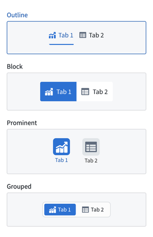
- Outline
- Size: Set the size for the tabs' display values to either default or large.
- Block
- Minimal styling: Toggle on to enable minimal block styling on tabs; this setting lightens the Active color (see below) used for active tabs.
- Size: Set the sizing for the tabs’ display values. Sizing options include Default or Large.
- Prominent
- Width: Set the width of the widget.
- Size: Set the size for the tabs' display values to either default or large.
- Grouped
- Size: Set the size for the tabs' display values to either small, default, or large.
-
Active color: * Set the tab color for the active tab.
-
Tab Height: Set a predefined section header height for the Tab widget.
- Custom: Set the height of tabs in the widget by entering a custom pixel value.
- Auto: Choose to have the height of the tabs auto-configured to the height of its container.
- Fill: When toggled on, the height of tabs in the widget will be set to the height of the widget.
-
Direction
- Horizontal: Displays tabs in the widget in a horizontal orientation.
- Vertical: Displays tabs in the widget in a vertical orientation.
- Alignment
- Left: Left-align all tabs in the widget.
- Center: Center-align all tabs in the widget.
- Alignment
Selection state
The Tabs widget does not hold its own selection state. Instead, selection state is derived from events configured for the widget. Switch to tab and Switch to page events that lead to no layout state change will be used to determine the selected tab. A default selected tab or page may be configured by setting a string variable to the tab or page name in the Variable-backed tab selection field of a tabbed section or in the Variable-backed page selection field in the settings panel.
Note that adding a Tabs widget to a module will not result in the generation of Switch to tab or Switch to page events. See switch to tab and switch to page for more information on how to generate these events for use in a Tabs widget.
No layout state change events
Events that do not change the layout state - that is, they lead to "no layout state change" - are layout events configured to switch to the selected tab or page that matches the current layout state. For example, a tab with a Switch to Tab A event configured will show as selected if the current layout state has Tab A selected.
Limitations
- If multiple layout events are configured, the tab with the most "no layout state change" events will be the selected tab, preferring the earliest tab in the case of a tie.
- Set variable value events are not currently used to check for selected tab state.
- If using a variable-backed selected tab, you may use Switch to tab events, which will update the selected tab variable state in addition to setting the selected tab state.
- If using a variable-backed selected page, you will need to use a Set variable value event in addition to a Switch to page event, as page change events do not automatically update the selected page variable value.