- Capabilities
- Getting started
- Architecture center
- Platform updates
Stepper
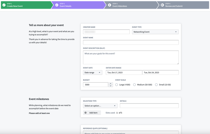
The Stepper widget is used to help navigate the user through a multi-step workflow, displaying and tracking progress as they walk through a sequence of steps.
Configuration Options
- Type
- Linear: Users are required to complete the steps in order.
- Non-linear: Users can freely navigate between steps and complete them in any order.
- Steps
- Create and define the configuration for each step of a workflow.
- Label: Sets the label to be displayed for the step in the widget.
- On click: Set event(s) to be triggered when the step is clicked in the widget.
- Is completed: Set a boolean variable to be used a check to determine when a step has been completed.
- Icon: Set the icon to be displayed for the step.
- Style
- Template
- Text only: Displays ordered numbers for each step in the widget.
- Use icons: Displays icons for each step in the widget. Icons can configured on a per-step basis.
- Show step number: Toggle on to also display step numbers on the widget when set to linear stepper type and set to use icons.
- Completed color: Sets the color for a step when it has been completed, triggered by when the boolean variable set for the step is true.
- Active color: Sets the color for the currently active step the user is on.
- Template